Blog
Reconciling a satellite fire perimeter with a GPS-walked line
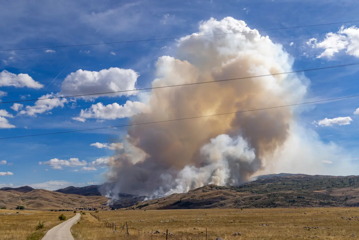
Every GIS unit on a large incident eventually hits this: the morning satellite perimeter doesn't match the GPS track a division sup walked the night before. Neither one is wrong. They're measuring different things at different times, and treating them as interchangeable is how you end up briefing a line that isn't where the fire is.
Why the two lines disagree in the first place
A GPS-walked line is a person (or a buggy, or a drone operator following the black) recording a track along what they can see and reach on the ground. It's tied to a specific hour, a specific crew's route, and whatever visibility they had through smoke. It shows where containment work happened as of that pass, and that can lag the current fire edge by several hours.
A satellite-derived perimeter comes from a sensor pass, usually SWIR-based so it can see through smoke that would blind an optical image, classifying pixels as actively burning, recently burned, or unburned. At 10-30 m resolution, a single pixel can straddle a dozer line, a fuel break, and a finger of unburned timber all at once. The satellite is reporting what burned at a coarser scale than a boot on the ground can confirm.
Add to that the time gap. A division might walk a line at 0600, the satellite overpasses at 1330, and by the afternoon brief the fire has backed down into a drainage that nobody walked yet. If you overlay the two without checking timestamps first, you'll spend the brief arguing about a discrepancy that's just the fire having moved in the intervening hours.
A working method for reconciling the two
Start by pulling the capture time on both layers before you look at geometry. Most arguments about "which perimeter is right" dissolve once everyone sees the GPS track is twelve hours older than the satellite pass, or vice versa.
Then overlay them as separate layers, not as a merged polygon. Where the satellite perimeter extends past the GPS line, that's your flag for new growth, a spot fire that jumped containment, or ground crews who haven't gotten eyes on that stretch yet. Hand that gap straight to Operations rather than trying to resolve it yourself.
Where the GPS line extends past the satellite burn scar, that usually means one of two things: the line was built ahead of the fire as anchor or contingency and hasn't burned up to it yet, or there's an unburned island inside the black that the crew walked around rather than through. Both are worth noting on the map with a different symbol than the fire edge itself, because briefing them as "perimeter" when they're really "line held, fuel still standing" sets up bad assumptions downstream.
Keep the source on every segment. A perimeter built from stitched GPS tracks, satellite classification, and IR flight data should carry an attribute field saying which is which, not get smoothed into one clean polygon that hides where the uncertainty sits. When burn severity grading enters the picture for recovery planning, that provenance matters even more. A severity class pulled from a satellite pixel that fell in a GPS-confirmed unburned island is wrong at that spot, and someone doing BAER work later will want to know why.
Finally, resist the urge to pick a winner. The GPS line is ground truth for where people have physically confirmed the edge. The satellite perimeter is your coverage for the miles nobody has walked yet, updated daily instead of whenever the next recon flight happens. The job is showing both, dated, so the ops brief reflects what's confirmed and what's inferred.
If your current workflow means waiting on the next recon flight to get a perimeter update at all, a perimeter layer refreshed daily from wide-swath satellite imagery gives you something to reconcile against every morning instead of every few days. Take a look at how Fire Perimeter Map handles the daily refresh and severity grading, and see if it fits your next shift brief.